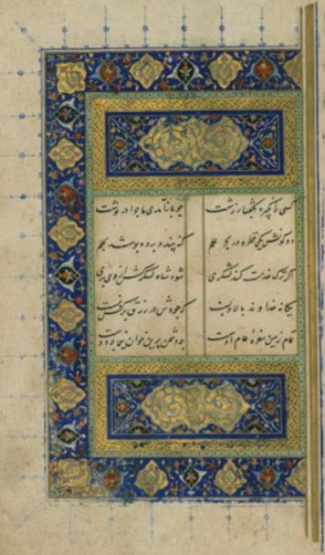
Persian Illumination
By Lady Symonne de la Croix
(Walters ms. W.624, Date: 725 AH/1325 CE, Language: Persian)
This documentation is to go along with a step by step video about my Persian Illumination class that I would have been teaching at the Known World Heraldic & Scribal Symposium, that had to be cancelled due to the CoViD-19 pandemic, which will now be an online virtual event.
The video of the class is available here:
I have written briefly on the differences between Persian and European Illumination, the two different genres Suratgari (figurative) and Naqqashi (non-figurative) painting. Note: This class is focused on the Naqqashi style.
I have added information on technique, paper, dyeing, sizing, burnishing, gold, ink, brushes and
the Persian pigment palette.
This is followed by a step by step of my process with photos.
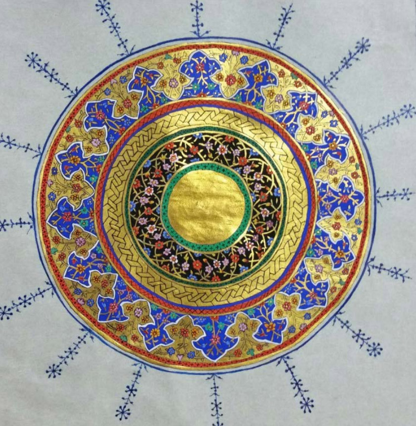
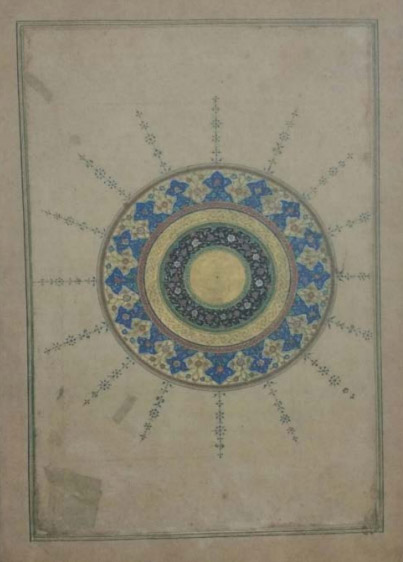
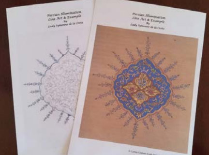
Included in this document is a link to a downloadable PDF of the line drawing of the Naqqashi Design with a copy of the completed piece that I did for use as a colour map.
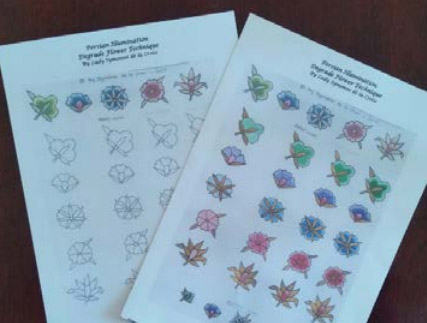
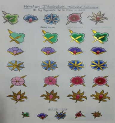
I have also added a downloadable PDF worksheet for doing the Degrade Flower Technique with a mini visual step by step of the process.
I have also added a couple of links to my shell gold and ink making experiments.
At the end of this documentation there is a brief step by step with photos of each step.
My hope is that people will read this documentation, download the line drawing and worksheet, and follow along with the video provided.
PERSIAN vs EUROPEAN ILLUMINATION
While Illumination was an important art in Europe as well as Persia, there were some significant differences between the two schools. These include:
- The preferred use of paper and its preparation which was often dyed, marbled and/or gold sprinkled. The paper was very commonly burnished to a high degree so that it was very smooth and shiny.[1,2,5,7,11,17,18]
- Persian treatise refer to gold being used as paint; gold particles dispersed in a medium, known in the west as shell gold.[1, 2, 3, 6, 10, 15]
They also mixed other metals to change the colour hue of the gold. Silver-rich gold looked cooler and had the appearance of what we would call today, champagne gold, and when the gold was mixed with copper it gave a warmer hue similar to a rose-gold colour. [1, 2, 3, 5, 6, 9, 10, 15] - The burnishing of coloured pigments and using (and not using) burnishing on different areas of the painted gold areas for different visual effects.
Persian painters aimed to produce slightly glossy opaque layers of paint.[1, 2, 3, 7, 8, 11, 12, 13, 17, 18] - The Persian artists mixed their pigments to achieve various colours, unlike the use of mainly pure pigment that the European illuminators preferred. [1, 5, 6, 8, 10, 15, 24]
GENRES OF PERSIAN PAINTING
There were two genres of Persian illumination paintings.
SURATGARI (figurative/figural art) and NAQQASHI (non-figurative/decoral art). [1, 2, 6, 8, 10, 20]
SURATGARI (FIGURAL/FIGURATIVE) art is classed as animate subjects such as humans and animals.
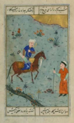
(Walters ms. W.620, Date: 9th C AH/AD 15th C, Safavid)
NAQQASHI (DECORAL/NON-FIGURATIVE) painting was limited to inanimate subjects, floral and vegetal designs. Closely copied after set patterns and designs.
(Walters ms. W.620.3A, Date: 9th C AH/AD 15th C, Safavid)
In the Persian treatise “The Canons of Painting by Sadiqi Bek” he states that there are seven bases (asl) [basic patterns or design motifs] for NAQQASHI (non-figurative/decoral) painting.
Firstly ‘islimi’ (the ivy and floral pattern) and ‘Khata’ (the Chinese floral pattern). The third and fourth, ‘abr’ (cloud-like, or marbled “veins of foliage”) and ‘vaq’ (head bearing tree). Fifth and sixth are ‘nilufar’ (the lotus) and ‘farangi’ (the Frankish pattern). The seventh is ‘band- rumi’ (the Anatolian knit pattern) [2]
The painter of the NAQQASHI genre was called ‘NAQQASH’ (decoral painter) in contrast to ‘MUSAVVIR’ (figural painter). Though an individual artist may well have practised both. [2]
PERSIAN TREATISES
There are at least 24 Persian treatises belonging to the Timurid (8th-9th century Hijra/14th-15th century CE), Safavid 10th-12th century Hijra/16th-18th century CE), Qajar periods (1193-1344 Hijra) [18] though only two of the treatise have been translated into English.[1,10]
One is Qanun us-Suvar (Canons of Painting) by Sadiqi Bek, a royal painter in the 16th century Safavid Iran.[2]
The second was an appendix to a text, Gulistan-i Hunan (Rose Garden of Art), written by Qadi Ahmad, son of Mir-Munshi, circa 1608, translated from Persian by V. Minorsky.[3] Both were written in what is now Iran.[6]
TECHNIQUE
The techniques described here are those used during the golden age of Persian painting that began early in the 15th century.
The Persian method of painting can be described as a watercolour technique since an aqueous gum solution most frequently served as the pigment binder. Western terms such as ‘wash’ (where the colour of the paper shine through translucent layers of paint) or ‘gouache’ (in which opaque,textured and chalky layers of paint include their own highlights through the addition of white pigments) are not applicable to Persian technique.
Persian painters aimed to produce slightly glossy, smooth opaque layers of paint. Unlike European artists,they did not concern themselves with the illusions of three dimensional space or a natural light source. The beauty of Persian technique was derived from harmony of colours and the interplay of line and pattern with solid colours.[1]
The paint required proper dilution. The consistency was enough to flow easily but not as much as a western watercolour wash. For lines and details the paint was somewhat less diluted.[1, 2, 3]
BURNISHING
Paint was built up in layers with each layer allowed to dry completely and burnished frequently until a slight gloss,opacity and desired intensity of hue were achieved.
Not all colours were burnished. Sadiq Bek warned about ultramarine blue. He said the colour was to be “laid directly with the medium” and not polished to a sheen. He said instead to apply a medium over the ultramarine (with perhaps a rabbit’s foot) and smooth it with the hand. Gold was burnished directly to create a glossy finish or through thin paper for a more raw appearance. In some cases it was left unburnished in different sections.
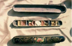
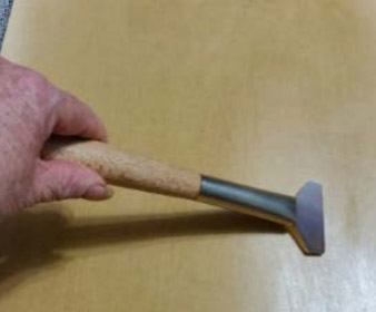
Burnishing tools (mohre) were made from different materials including agate stone (aqiq), jade (yasm), ivory (aj), glass (zejaj), crystal (bolur) and shell (jis).[1, 2, 3, 8, 11, 12, 13, 17, 18]
PAPER – KAGHID
Paper was first produced in Khorasan by Chinese captives in the second Century Hijra (around 750CE) and as time went on, Persia developed into an important paper making centre [18]. Handmade paper is usually made in some type of mold. While European papermakers used techniques that left chain lines in the paper, the Persian use of horsehair thread to stitch the mold together did not leave an impression in the paper (Snyder 1988)
Another difference between Persian and European paper making techniques was that Persian papermakers did not use watermarks as part of the paper production (Bosch et al 1981) unlike their European counterparts.[1,13]
Materials used to make the paper were well beaten fibres of mostly linen, hemp or a combination. Silk was also mentioned as a material for making paper.[1, 8]
Further treatment of the paper often included dyeing, marbling, gold sprinkling, sizing and burnishing.[1, 11,12 ]
There were different types of paper such as, single sheet, two layered paper (kagad-e puste), three layered paper (kagad-e se puste), paperboard (muqawwa) and albums (muraqqa).[1, 4, 18, 24]
DYEING
Historical evidence from the Timurid and Safavid eras showed that paper in those years were generally dyed. According to them, white paper had a ‘harmful effect on the eyes’ [18]
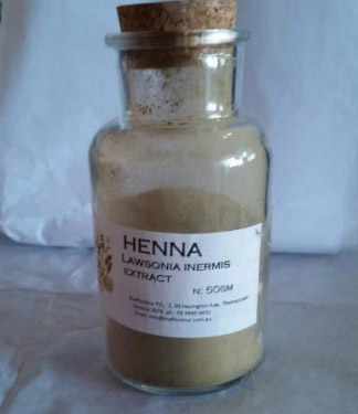
The most recommended dye for colouring paper was henna which was often mixed with saffron, sometimes with drops of black ink.
Henna dye in the in the concentration of 1:10 ratio that the Persian masters recommended had the added benefit of preventing fungus growth, specifically aspergillus flavus [18]
SIZING
A large amount of sizing material was used according to historical treatise from Tamurid (15thC) and Safavid (16thC).[12]
These included wheat starch (neshasteh-e gandom), rice starch (haliat al-letab), mucilage of rice (loab berenji), fleawort seed (ispaghol), mucilage of marshmallow (loabi khatmi), grape syrup (shireh-e angoor), juice of sweet melon (kharboozeh), cucumber seeds (tokhmi khiar), fish glue (sirishi mahi), gum arabic (samqi arabi), serish (a well known vegetable glue traditionally used for book binding in Iran), gum tragananth and proteinaceous materials such as animal glue, egg yolk and egg whites. With cucumber seed mucilage and vegetable based starches being the most common. Interestingly cucumber seed mucilage, which was very commonly used, is the easiest to burnish and it is less prone to attack by microorganisms.
In the treatise “Favayedal Khotoot” he states that sizing is used to make fragile paper strong, to reduce fluffiness as well as to make it smooth for writing.[1, 5, 11, 12, 13, 17, 18]
TRACING AND UNDERDRAWING
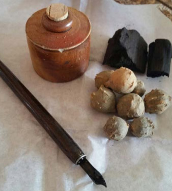
The design was drawn using a charred twig (tamarind), or ink with a pen/brush.
Tracing was also utilised. A thin piece of paper (or translucent gazelle skin) was used to trace over a master drawing or painting. Then a pointed awl (minfad) was used to pierce around the tracing lines. (Pierced tracings could be used multiple times). Charcoal powder in a thin fabric (pounce) bag was then pounced through the pierced holes onto prepared paper
INK – AHBAR
A variety of different coloured inks were used with carbon-based (midad) black ink being the most common found via Raman Spectroscopy.
In Qazi Ahmad’s treatise he mentions 4 recipes to prepare black ink, two of them used lamp black. (Gallnuts were also used as an additive.)
This type of carbon-based black pigment is also often mentioned in published literature on Iranian painting techniques.[1, 2, 3, 10, 11, 12, 13, 15, 17, 18]
PERSIAN PIGMENT PALETTE
The pigments of Medieval Persian manuscript painting divide into two chemical groups,
inorganic and organic.
The artists relied more on the inorganic. Some scholars insist that ‘only’ inorganic pigments were employed in Persian painting (Behzad 1939) but scientific analysis and mention of organic pigments in treatises disprove that theory.
The Persian palette remained consistent, as found via raman spectroscopy, microscopic analysis, micro-chemical analysis FTIR and XRD methods, Persian treatises and paint boxes from museums and private collections.[1, 2, 3, 5, 6, 9, 10, 15, 18]
The palette range was relatively small (red, yellow, blue, green, white and black).
Gold was used pure or mixed with other metals. The artists mixed the metals to obtain different ranges of colours, which is in agreement with published analyses of Persian pigments.[1, 3, 6, 15]
The colours were said to reflect “joy and cheer” (Al-Basha,1988).[8]
| WARNING Using some period pigments can lead to significant health issues and/or possible death. Please read the relevant Materials Safety Data Sheets and follow the recommended precautions. |
GOLD, SILVER AND COPPER – DHAHAB, FIDDA AND NUHAS
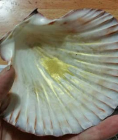
Metallic powders crowned the Persian palette. Gold ‘paint’ was used on most of the Persian paintings. Treatises give details of making gold ‘paint’ (shell gold) Gold was crushed to particles with honey or glue, sometimes with the addition of salt. Gum arabic is also mentioned. It was then repeatedly rinsed to remove the additives. After that is mixed with a binding medium to be applied with a brush (qalam).
It was then cooked (burnished) to a bright glossy gold. Interestingly, some manuscripts show both burnished and unburnished gold beside each other for a visual effect. [1, 2, 6]
Gold does not give off a first order raman spectrum signal so it is not detectable by raman spectroscopy.
Raman spectroscopy is based on the inelastic light scattering in a substance where the incident light transfers energy to molecular vibrations. The scattered light can be detected by a Raman spectrometer and represents a “chemical fingerprint” of the substance. Which enables various pigments and other substances to be identified.[25]
Raman spectroscopy shows silver-rich gold. This was because the artists mixed the silver with the gold to make it a cooler colour [Behzad 1939, St.Laurent-Lockwood 1981), something like the modern hue of Champaign Gold. Silver was often used in water images. Unfortunately the silver now looks black because it has tarnished over time. Gold was mixed with copper to give a warmer looking gold.[1, 15]
I have experimented with making shell gold, here is a link to my efforts.
BLUE – AZRAQ
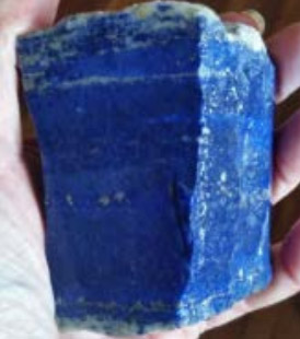
Most scholars of Persian painting acknowledge natural ultramarine, Lapis Lazuli (lajevard), as the most important blue pigment and its use was documented in both Sadiqi and Qadi’s treatises.[1, 2, 6, 15]
The Herat school favoured darker and richer shades whereas other centres such as Tabruz, Shiraz and Esfahan favoured a brighter cornflower blue.[7]
Indigo which was introduced into Iran in mid 6th century was also used but more commonly as a mix with orpiment or saffon to make a different green shade.[6]
YELLOW – ASFAR
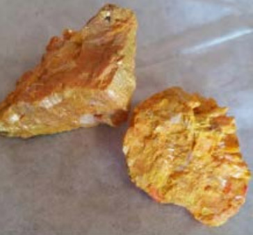
Orpiment (zarnikh asfar) was the most frequently found yellow via raman spectroscopy and mention of it in Qadi provides evidence of its importance in the Persian palette.
Orpiment posed its own problems with its incompatibility with certain other pigments. For example, orpiment turns white lead gray even when not mixed together, it has this effect even if it is only adjacent to it in the painting.
Other yellows were also used. Indian yellow, reportabely made from the urine of cows fed exclusively on mango leaves, Saffron, Safflower, Yellow Ochre, Tumeric root and a pigment made from Persian Berries were also available for use.[1, 5, 6,15, 24]
RED – AHMAR
Vermillion was the most common red found via raman spectroscopy – both Qadi and Sadiqi give two ways of obtaining vermillion, from cinnabar (zanjafr) and from mercury/sulfur reaction.[2, 3, 6, 15, 24]
Red lead (salqun) also known as minium. This comes in a natural form but is more commonly made artificially white lead.[2, 6, 15, 24]
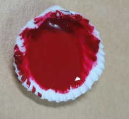
Organic reds were identified, particularly kermes/carmine,as well as madder and brazilwood/sappanwood (baqqam kahhal) Sadiqi gives a recipe for making a ruby-red lake using stick lac (lukk).[3, 5, 15, 24]
Realgar was mentioned often in treatise but was seldom found via Raman Spectroscopy. This could possibly be due to degradation.
Realgar often occurs with orpiment and was sometimes referred to as Red Orpiment.[2, 5, 6]
BLACK – ASWAD
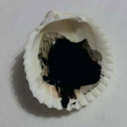
Carbon based black. Bone black, lamp black and irongall were all found on manuscripts via raman spectroscopy.
Charcoal was also found in small amounts but is not mentioned in literature except for underdrawings or used as a pounce.[1, 6, 15, 24]
WHITE – ISFIDAJ
The predominant white was lead white though chalk and calcite were occasionally found, though chalk could have been used as paper preparation in the form of a pounce more so than as a pigment colour.[15]
GREEN – AKHDAR
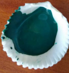
According to treatises, the preferred green pigment of Persian artists was verdigris.[1, 2, 6]
Historically, verdigris is a general term for green corrosion products that form on copper, brass and bronze.[1]
Sadiq gives instructions for making verdigris.[1, 2]
Link to my verdigris experiment.
Verdigris (zinjar) was known for its instability and destructive nature. Cennini[21] mentioned that verdigris ‘is beautiful to the eyes, but does not last’ and Theophilus warned against using ‘green salt’ for book illumination as ‘it is not good for books’.
This was also known to Persian artists. In Resaleh dar Bayan-e Kagad ‘Morakkab va Hall-e Alvan’ he cautioned against the use of verdigris ‘…zangar (verdigris) is not stable and will char the paper’.
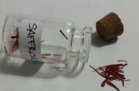
However, many Persian recipes say to add saffron (za’faran), threads of Crocus Sativus, to verdigris to counter it’s destructive effect.
Mir ‘Ali Heravi in Medad al-Kotut: “The verdigris that is made out of yoghurt, chars paper. The answer is to add a small amount of saffron (za’faran) so [it] becomes stable”.[18]
Saffron acts as a buffering agent which acts as an inhibitor that prevents charring by maintaining a constant pH.[5, 15, 18]
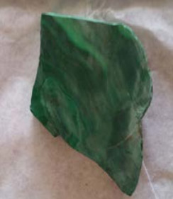
Malachite, vergaut and brochatite were also found and the most common green mix was saffron and indigo.[1,2,6,15,18]
PIGMENT BINDING
There are different views on what was used as the binder for pigments. In T. Behzads discussion on binder medium (Behzad p1921-1922), he states that albumen (glair) was the medium “in the earliest period” but due to difficulties on keeping it fresh, glue was then substituted with gum arabic sometimes used instead.
Gum arabic (samgh al-qaraz) was the main binder for pigments mentioned in Qadi Ahmad’s treatise for pigments, he also mentions glue and vinegar for certain pigments.[1, 2, 3, 24]
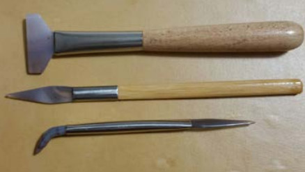
BRUSH AND HANDLING
According to the Persian treatise be Sadiqi Bek, brushes (qalam) were made from a squirrel’s tail which is vigorously combed and sorted in even lengths. Then it is tied with 3 separate knots. [There is some literature about brushes being made from hairs from the throat of a Persian kitten (Behzad 1939)]
Sadiqi also comments on the handling of the brush, not to use a clenched fist….’the main hold for the brush is with two fingers (thumb and forefinger); the other three must provide the support if your brush strokes (tahrir-i qalam) are to swerve freely about (pichideh ayad). For your work wants a certain dash (daliri), and the brush is to be taken easily in hand’.
In Sadequi Beg treatise, he also gave specific instructions on how to hold the qalam..”do not grasp your brush (at the place of the knots) in your fist, with two fingers make a holding place for your brush; Three others will support those two,do that drawing of your brush becomes considered. At this time of working you must be courageous; you must not hold your brush too tightly…” (Afshar, circa 1530) [1, 2, 3, 7]
MEDIEVAL WHITE OUT
In Qadi Ahmad’s treatise there is advice for correcting mistakes.
“How to remove writing from paper.- Take some liquid ceruse (safid-ab-i arziz), triturate it with liquid gum arabic and apply to the writing. When it is dry,use the polisher and the writing will disappear” [3,15]
Stighs- rays? [4,7]
STEP BY STEP
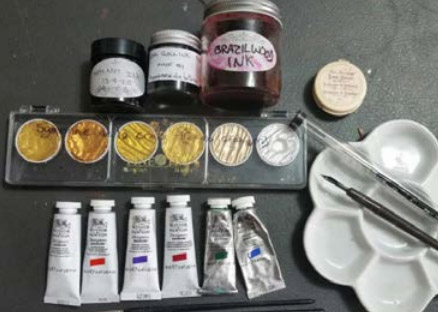
Clockwise from top left: handmade walnut ink, handmade iron gall ink, handmade brazilwood ink, brush cleaner, palette, Winsor & Newton series 7 paintbrush, crow quill, Winsor & Newton artists quality gouache (Ultramarine Blue, Permanent Green Middle, Permanent Alizarin Crimson, Brilliant Purple, Cadmium Red {which I did not end up using} & Permanent White) and Finetec gold from which I used the Arabic Gold hue.
| Note: It is not necessary to use all of the above supplies. Project can be completed with a selection of paint (including gold), a paint brush and a fine liner. |
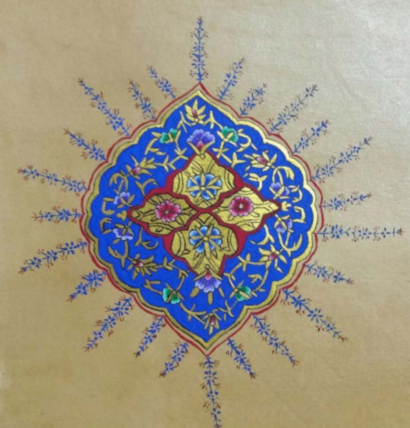
1. Design is transferred (desen silkeme) to ‘laid paper’ (muraqqa)- a special paperboard of 3-4 “engrained” (dyed) handmade paper layers that have been glued together in a specific technique[4], then sized (surface treated) and burnished.
I created my own muraqqa paper for this piece by dyeing commercial watercolour paper. When dried I ‘sized’ it with egg white then burnished it heavily until it was shiny and smooth.
Alternatively, any good quality smooth Hot Pressed Watercolour paper can be used. It is not necessary to dye, size and burnish your paper to paint this design unless you choose to.
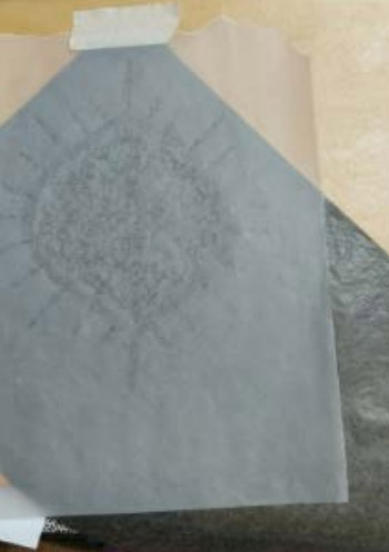
To transfer the design I used tracing paper and commercial graphite paper. You can make your own graphite paper by rubbing heavily with graphite. Any of the darker B range works well and is easier to erase.
Link to printable line drawing of the line drawing of design and coloured version.
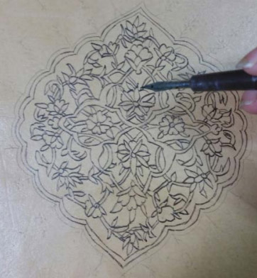
2. Design is inked so as not to be lost whilst painting.~ I used handmade walnut ink and a crow quill. An artist’s quality micron liner can be used.
I have experimented in making walnut ink and the details can be found here.
3. Gold is used to paint vine and leaves etc which is then burnished. Traditionally shell gold was used. I used Finetec Arabic Gold but any artist’s quality gold gouache will work just as well.
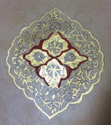
4. Paint base colours for flowers.
Note: The consistency used on Persian Illumination is quite fluid.
For gouache I find the consistency of very runny melted ice cream (but not watery) works best. The colours should be opaque, not like a watercolour wash. Finishing details can be slightly thicker.
When using period pigments the consistency can be a little thicker but still fluid depending on the pigment.
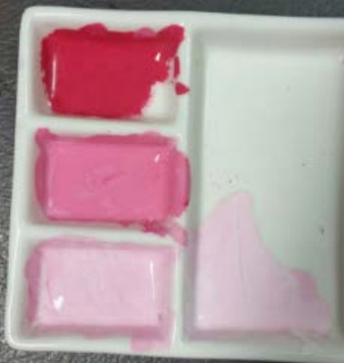
I painted the central red colour of the design with Winsor & Newton Alizarin Crimson.
5. ‘Ornamental’ lines are inked in black around gold work and base flowers to separate it from the background.
This is for visual appeal and to separate the pigments which was something that medieval artists had to be very conscious of due to the different reactions between pigments.
Orpiment in particular has to be well thought out when placing colours due to its reactive nature to certain other pigments. For example when placed even just beside lead white it will turn it gray.
I used handmade iron gall ink and a crow quill. A small paintbrush and fluid black paint or ink can be used or a modern micron liner pen.
Here is a link to my effort of making iron gall ink.
6. Flowers are then toned in a ‘degrade’ style.
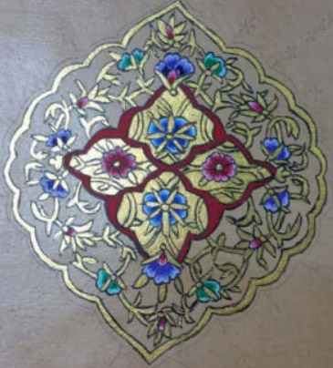
DEGRADE TECHNIQUE:
Multiple tones obtained from each colour painted, from lightest to darkest (or darkest to lightest) by decreasing the shape of the flower with each paint line.
For this piece I made 3 tones of each colour by adding white and finished with the pure colour of each.
I painted the base layers, which I let dry, then added the next colour tone following the pattern of the flower with about 1mm space between each different tone, finishing with the pure colour.
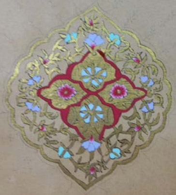
7. Paint the background colour around the design. In most extant pieces that I have seen, the dominant colour used was Lapis Lazuli in its pure form or as refined ultramarine. Again the consistency is very fluid.
I used Winsor & Newton ultramarine gouache.
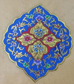
Though this would seem to be an unnecessarily tedious way of working as it would appear more logical to paint elements on top of the background colour there are good reasons for this, driven by the properties of the pigments themselves, particularly Lapis Lazuli.
There are difficulties in applying colours on top of a field of Lapis, especially noticeable when using gold, which sinks right into the Lapis and can’t be burnished. Thus the illuminator must rely on their skill to work it cleanly around the fine lines of the intricate design.[1, 5, 7, 10]
8. Paint a thin line around the outline of the design following the basic shape.
I used a small brush and Winsor & Newton Alizarin Crimson. I chose this colour as it appealed to me and to give a more uniform look to the piece as I had used it in the middle section as a base colour.
Green and blue were commonly used for the outlining.
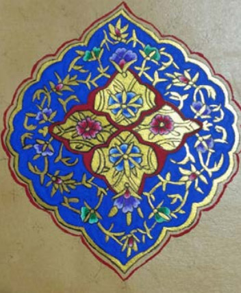
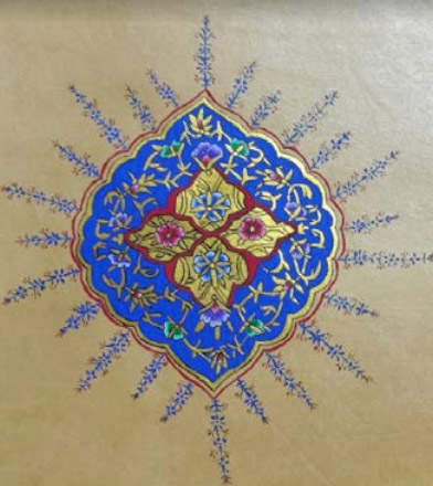
9. Needlepoint designs (tighs) are added to the outer edge.
These are fine sharp decorative lines extending outwards from the main part of the design to complete the artwork.[4, 7]
I used a small paintbrush, fluid Winsor & Newton ultramarine gouache, a crow quill and handmade brazilwood ink.
Coloured artists quality micron liners could be used.
I would love to see your completed works and can be contacted via facebook or email.
Copyright 2020 Corina Graham. Please do not reproduce without permission.
| 1. Purinton, Nancy and Watters, Mark. ‘A Study of the Materials Used by Medieval Persian Painters’. Journal of the American Institute for Conservation. JAIC 1991, volume 30, number 2, Article 2. 125-144 |
| 2. Dickson, M.B., and Welch S.C. 1981. Appendix 1: The Canons of Painting by Sadiqi Bek. The Houghton Shahnameh, vol. 1. Cambridge, Mass: Harvard University Press 259-69 |
| 3. Minorsky, V, trans. 1959. ‘Calligraphers and Painters: A treatise by Qadi Ahmad, Son of Mir Munshi (circa A.H 1015/A.D. 1606) Washington, D.C.: Smithsonian Institute, Freer Gallery of Art, Occasional Papers 3 (2): 174-201 |
| 4. Onat, Sema. ‘Islamic Art of Illumination’ Blue Dome Press. New Jersey. USA. 2017. Book |
| 5. Knipe, Penelope et al. Materials and Techniques of Islamic Manuscripts. https://springer.com/article/10.1186/s40494-018-0217-y |
| 6. Muralha. Vania et al. Raman Spectroscopy Analysis of Pigments on 16th-17th c. Persian Manuscripts. Spectrochimica Acta Part A 92 (2012) 21-28 |
| 7. Chowdery, Anita. A Visual Analysis of the Illuminated Opening pages of a 16th Century Iranian Manuscript, and a Reconstruction with Reference to Contemporary Treatise and Empirical Practical Experimentation. Abstract for proposed paper for the 8th Islamic Manuscript Conference at Queen’s College, University of Cambridge, 9-11 July for The Science of Manuscripts |
| 8. Al-Yahyai, Fakhriya et al. Islamic Manuscripts Art in Arabic and Persian Schools: The Artistic and Aesthetic Values. Scientific Research. An Academic Publisher. ADR> Vol 7, No2,May 2019 |
| 9. Bruni, Silvia et al. Micro-Raman Identification of the Palette of a Precious XVI Century Illuminated Persian Codex. Journal of Cultural Heritage 4 (2001) 291-296 |
| 10. Burgio, Lucia et al. Pigment Analysis by Raman Microscopy of the Non-Figurative Illumination in 16th-18th century Islamic Manuscripts. Journal of Raman Spectroscopy 2008 www.interscience.wiley.com |
| 11. Heilbrunn. The Arts of the Book in the Islamic World, 1609-1800. Timeline of Art History. The Metropolitan Museum of Art |
| 12. Barkeshli, Mandana. Historical and Scientific Analysis on Sizing Materials Used in Iranian Manuscripts and Miniature Paintings. Presented at the Book & Paper Group Session, AIC 31st Annual Meeting. Arlington, Virginia. 2003 |
| 13. Rafi, Ali Mashhadi and Afshari, Tooba. Material Analysis of Safavid Isfahani Papers. Hamburg 2013 |
| 14. Persian Empire. https://en.wikipedia.org/wiki/Persian_Empire |
| 15. Wyth, Elena HL. CSM, CIM. Middle Eastern Palette: A Survey of Pigments Found in Middle Eastern Countries from the 10th-17rh Centuries elenawyth@gmail.com |
| 16. Peri, Benedek. Persian Manuscripts from the Ottoman Empire in the Collection of the Library of the Hungarian Academy of Sciences. 2nd International Archive Congress on Ottoman Lands. |
| 17. Mahgoub, Hend et al. Material Properties of Islamic Paper. Institute for Sustainable Heritage, University College London UK 2016 hend.mahgoub.13@uclac.uk |
| 18. Barkeshli, Mandana. Material Technology and Science in Manuscripts of Persian Mystical Literature. Manuscript Cultures 2002 |
| 19. Hunter, David. Papermaking, the History and Technique of an Ancient Craft. Dover Publications Inc. New York 1943. 1947.1978. Book |
| 20. Rice,David Talbot. Islamic Art. Library of Congress catalogue card number 65-10179. Thames & Hudson Ltd. London 1965, 1975. Book |
| 21. Thompson, Daniel V. “Il Libro dell’Arte” Yale University Press 1933,1960 |
| 22. Rive, Megan ni Laine de Belle. “A Palette of Period Pigments” The Compleat Anachronistic #43. The Society of Creative Anachronism 1989,1999,2004,2017 booklet |
| 23. Artists Pigments: A Handbook of their History and Characteristics, vols 1-3. Washington: National Gallery of Art, 2012 |
| 24. Medlej, Joumana. Inks & Paints of the Middle East. A handbook of Abbasid Art Technology. Majnouna, London 2020. |
| 25. https://wiki.anton-paar.com/au-en |